
Graphs and Charts: Meaning and Type | Importance of Charts
Graphs
Graphs are defined as those visual graphics aids which help in the visual representation of numerical data with the objective of providing a gist of information along with revealing any important relationships (such as trends and variations from normal), contained in the data as quickly and effectively as possible
Types of Graphs
The most commonly used types of graphs are-
- line graphs,
- bar graphs,
- circle or pie graphs and
- pictorial graphs
Line graphs
Line graphs are the most accurate and commonly used graphs. The facts, information and concepts related to the subject matter are represented with the help of some straight lines in a line graph. The length and breadth of the straight lines- horizontal and vertical- work towards showing trends, growth or frequency and also provides a quick comparison between two or series of data. The line graphs can be roughly divided into two categories, viz. one using only one horizontal or vertical axis (also known as timeline) and the other using both the axes.
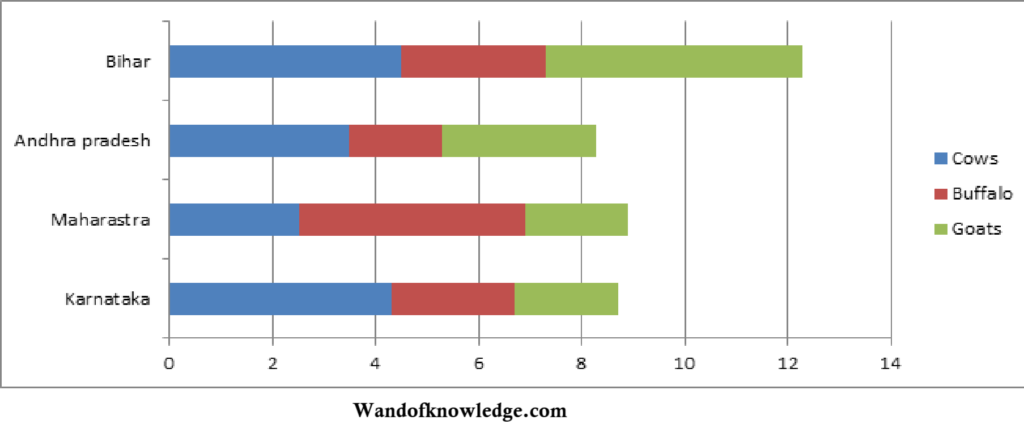
Bar graphs
In such types of graphs, we make use of some bars for providing comparative study of the given data, instead of straight line as in the case of line graphs. While the width of the bars is kept equal, their length expressing the amount or percentage of data is allowed to vary for providing comparison. Occasionally, a considerable number of bars are used and for the distinction and making them readable, these bars are provided with distinctive colours and shades. The bars can run either vertically or horizontally.
For example- A horizontal bar graph is given below:
Circle or Pie Graphs
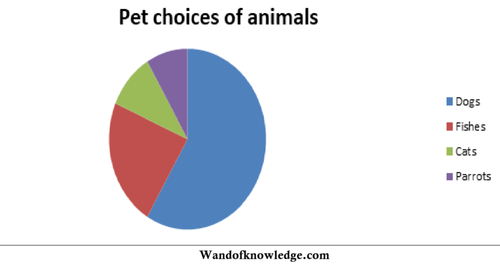
In the situation when a teacher intends to explain the relationship of individual quantities to a whole, then he may easily and effectively take the help of circle or pie graphs. These graphs can be conveniently made by drawing a circle, dividing the circle into sectors or segments to represent component parts of a whole and then indicating the meaning of each segment by lettering. While the circular figure of these graphs as a whole, represents the total or the whole amount provided in the given numerical data, the parts or segments of the circle signify the percentages or fractional parts of the whole or the total.
Pictorial graphs
In such type of graphs, the visual representation and comparative study of the numerical data are done with the help of some suitable symbols and pictures. For what numerical figures or amount, a given symbol or picture stands is fully explained in these graphs for providing easy and quick visual interpretation and comparison of the relative quantitative data.
Charts
Graphs, on account of their large dependence upon symbols are considered as more abstract graphical material than the pictures. However, graphs have their own significance as a good summarizing device to represent and compare numerical data. The merits and advantages of both graphs and pictures are carried over to another graphic material known as chart.
Wittich and Schuller defined chart as “combination of graphic and pictorial media designed for the orderly and logical visualizing of relationship between key facts or ideas.”
Importance of Charts
Charts are useful at every stage of the classroom teaching, for instance, in testing the previous knowledge and introducing the lesson, in systematic presentation of the subject matter, in the tasks of recapitulation and drill work, and in the assignment of homework to the students. Hence, they are commonly used by all teachers for carrying out the instructional work.
The importance of charts is in their very nature of representing and communicating the desired information, facts and numerical data related to a subject visually in a beautifully synthesized graphical and pictorial form. In the task of systematic presentation of facts, ideas and relationships, they prove more effective than other graphics like pictures, graphs, diagrams and photographs. For instance, systems and organizations of the private and government sectors, the rulers of the Mughal dynasty, great events in the history of Indian independence, election of the President of India, the organization and functioning of the judiciary, the factors influencing the climate of a region and similar other topics related to the school curriculum can be effectively visualized and represented through relevant charts. The functions served by the charts may be summarized as follows:
- To show relationships such as comparisons, relative amounts, developments, processes, classification and organization by means of facts, figures and statistics
- To present information in a summarized form
- To help in the visual presentation of the abstract ideas
- To help in the quick clarification of meanings which often save considerable time in the presentation of the subject matter
- To raise issues and help in the process of systematic thinking and intelligent understanding.
- To inculcate interest, capture students’ attention and provide motivation for carrying out instructional work.
Types of Chart
The most common types of charts used in the classrooms are as follows:
Tree Charts
The figures drawn in these charts resemble a tree. While the several roots of this tree leading to a single trunk represent the origin of an organization or structure, the multidimensional growth and development of this organization or structure is visually represented through various branches, stems and levels. All types of charts, in general, are used in showing development, growth and changes resulting from a combination of major factors.
Time Chart
Time charts are used to indicate the time sequence of a series of events or to arrange all the happenings important to the development of a process, organization or nation in a chronological order.
Flow Chart
Flow charts are also referred to as organizational charts. They can be employed to represent the organization of almost anything, from the individual department and student council to a big company, city or a nation. The organizational elements and the functional relationships in such charts are usually shown through various symbols and forms like rectangles, circles, lines, arrows and colours.
Issue Chart
Issue charts are specially meant for highlighting a particular issue or problem, e.g. for explaining or highlighting the issues related to the flow of food energy on earth may be illustrated through an issue chart.
Table Chart
In table charts the data is presented in a tabular form. The railway timetable and school timetable are two good examples of such tabular representation. The chief value of such representation is in its ability to show time relationship and providing a quick comparison and contrast among the various ideas and events. It may be easily visualized that such charts are heavily dependent upon language, words and numerals than upon visual symbols and pictures.
Pictorial Chart
In pictorial charts the matter is illustrated through pictures, diagrams, graphs, sketches and language. This is the most commonly used type of chart in classroom teaching.
You may also like
- Statistics- Meaning | Definition | Characteristics and Aims
- Statistics: Nature | Importance & Limitation with pdf
- Graphical representation of Data: Meaning & Importance
- Measurement of Central Tendency: Mean Median Mode
- Distance Learning: Meaning and its Characteristics
- Advantages and Disadvantages of Distance Education
Disclaimer: wandofknowledge.com is created only for the purpose of education and knowledge. For any queries, disclaimer is requested to kindly contact us. We assure you we will do our best. We do not support piracy. If in any way it violates the law or there is any problem, please mail us on wandofknowledge539@gmail.com